
|
|
| Правила Форума редакция от 22.06.2020 |
|
|||||||
|
|
Окажите посильную поддержку, мы очень надеемся на вас. Реквизиты для переводов ниже.  WMZ: Z021474945171 WME: E159284508897 WMUSDT: T206853643180 4100117770549562 Спасибо за поддержку! WMZ: Z021474945171 WME: E159284508897 WMUSDT: T206853643180 4100117770549562 Спасибо за поддержку!
|
|
 |
|
|
Опции темы | Опции просмотра |
 Language
|
 17.01.2011, 16:34
|
 #1
#1
|
|
Ветеран
 Пол: 
Регистрация: 18.11.2006
Адрес: Киевская Русь
Сообщений: 9,017
Репутация: 84746
|
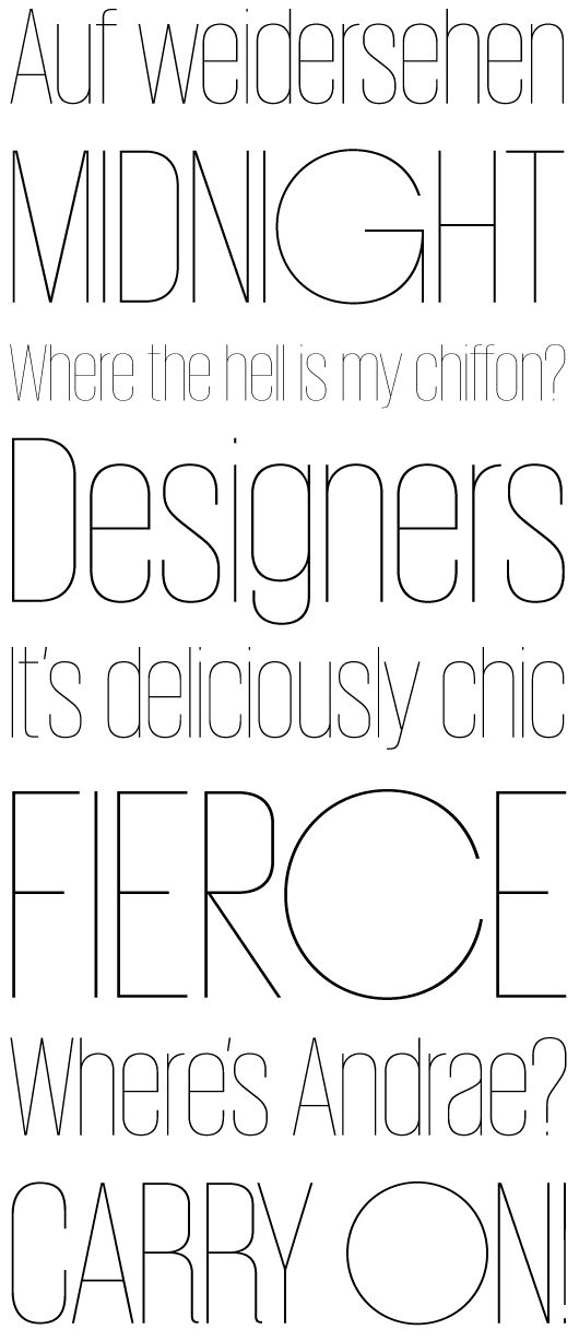
 Foundry, est. 2009 or 2010 by Paul Barnes (London) and Christian Schwartz (New York). Their own blurb: Commercial Type is a joint venture between Paul Barnes and Christian Schwartz, who have collaborated since 2004 on various typeface projects, most notably the award winning Guardian Egyptian. The company publishes retail fonts developed by Schwartz and Barnes, their staff, and outside collaborators, and also represents the two when they work together on typedesign projects. Following the redesign of The Guardian, as part of the team headed by Mark Porter, Schwartz and Barnes were awarded the Black Pencil from the D&AD. The team were also nominated for the Design Museum's Designer of the Year prize. In September 2006, Barnes and Schwartz were named two of the 40 most influential designers under 40 in Wallpaper. In house type designers in 2010: Paul Barnes, Christian Schwartz, Berton Haasebe, and Abi Huynh. Austin (+Cyrillic): Designed for British style magazine Harper's&Queen, Austin is a loose revival of the typefaces of Richard Austin of the late 18th century for the publisher John Bell. Working as a trade engraver Austin cut the first British modern and later the iconoclastic Scotch Roman. Narrow without being overtly condensed, Austin is a modern with the styling and sheen of New York in the 1970s. Designed by Paul Barnes and Ilya Ruderman from 2007-2009. Has a Cyrillic. Giorgio (+Sans): Giorgio and its matching sans were designed for Chris Martinez at T, the New York Times Style Magazine, bringing runway proportions to the page in contrasting ways. Designed by Christian Schwartz, 2008-2009. Graphik: The dominant trend of the mid twentieth century simple sans serifs still reverberates in visual culture. Graphik proves that it is still possible to create something refreshing inspired by this era. Taking cues from the less-known anonymous grotesques and geometric sans serifs, Graphik is perfectly suited for graphic and publication design. Originally designed for the Schwartz's own corporate identity, it was later finished for Condé Nast Portfolio and then expanded for Wallpaper and later T, the New York Times Style Magazine. Designed by Christian Schwartz in 2009. Guardian (Egyptian Headline, Sans Headline, Egyptian Text, Agate Sans): What happens when you try to make a new sans serif by chopping the slabs off of an Egyptian? That was the original inspiration behind this modern classic designed for Mark Porter and the Guardian newspaper. Comprised of several interrelated families: Sans and Egyptian for headlines; a Text Egyptian; and an Agate Sans, every possible typographic need of a daily paper is fulfilled. Serious news headlines, expressive features, readable text, tiny financial listings, info graphics, and everything in between can be capably handled with ease. Designed by Paul Barnes and Christian Schwartz, 2009. Lyon Text: Begun as Kai Bernau's degree project on the Type + Media course at the Royal Academy of Art (KABK) in The Hague, Bernau extensively revised the typeface in time for its debut in the New York Times Magazine in 2009. Like many of the great seriffed typefaces it draws intelligently from the work of Robert Granjon, the master of the Renaissance, while having a contemporary feel. Its elegant looks, are matched with an intelligent, anonymous nature, making it excellent for magazines, book and newspapers. Designed by Kai Bernau, 2009. Neue Haas Grotesk (2011). Stag (+Sans, Dot, Stencil, Sans Round): Stag started as a small family of slab serifs commissioned for headlines by the US edition of Esquire magazine and eventually grew into a sprawling multi-part family including a flexible sans companion and two additional display variants that are probably best described as special effects. Designed by Christian Schwartz, Berton Hasebe and Ross Milne, 2008, 2009. Atlas Grotesk (2012, by Kai Bernau, Susan Carvalho and Christian Schwartz, Commercial Type). A revival of Dick Dooijes's Mercator. http://commercialtype.com/typefaces http://www.christianschwartz.com/bio.shtml Последний раз редактировалось planemo; 03.01.2014 в 12:50.. Причина: fixed broken image |

|


|
| Эти 23 пользователя(ей) сказали cпасибо за это полезное сообщение: |
|
|
| Реклама: |
|
25.07.2012, 22:15
|
#2
|
|
Постоялец
Пол:
Регистрация: 11.11.2010
Сообщений: 510
Репутация: 6617
|
 Austin Austin Cyrillic DB Sans DB Serif Graphik Lyon Display Lyon Text Platform Stag Stag Dot Download Последний раз редактировалось wolto; 20.04.2015 в 13:20.. |
|
|
|
| Эти 32 пользователя(ей) сказали cпасибо за это полезное сообщение: | Скрыть список поблагодаривших Aikami Raito, alma2006, antavix, archoruz, awaykd, Brent, cera11, chico987, concruencer, doctor ru, IVS_05, Jedrek, jhorvat, kozachenko, kurepii, laboo, NET_Goblin, NuttShell, pepcek35, premek, raizzz, RED2RED, Sekturina, somtri, s_white, typoblur2, typrat, vovanic, vovel67, xyxyzlab, zunhoang, Мудун |
|
17.08.2012, 11:04
|
#3
|
|
Banned
Пол:
Регистрация: 28.03.2009
Сообщений: 7
Репутация: 69
|
Последний раз редактировалось convoy88; 05.05.2015 в 01:09.. |
|
|
|
| Эти 18 пользователя(ей) сказали cпасибо за это полезное сообщение: |
|
12.09.2012, 07:49
|
#4
|
|
Ветеран
Пол:
Регистрация: 18.11.2006
Адрес: Киевская Русь
Сообщений: 9,017
Репутация: 84746
|
 Neue Haas Grotesk (11 x OTF: by Christian Schwartz, 2011) http://www.myfonts.com/fonts/linotyp...-haas-grotesk/ http://www.linotype.com/6598/neuehaasgrotesk.html download Последний раз редактировалось convoy88; 05.05.2015 в 01:09.. |
|
|
|
|
12.09.2012, 11:42
|
#5
|
|
|
Пользователь
Пол:
Регистрация: 03.08.2012
Сообщений: 131
Репутация: 1638
|
Houston by Christian Schwartz (16*OTF) Deck, Headline, Text

Последний раз редактировалось convoy88; 05.05.2015 в 01:09.. |
|
|
|
|
|
26.10.2012, 21:10
|
#7
|
|
|
Пользователь
Пол:
Регистрация: 22.04.2011
Сообщений: 78
Репутация: 466
|
Stag Rounded

Последний раз редактировалось convoy88; 05.05.2015 в 01:10.. |
|
|
|
|
|
27.10.2012, 01:20
|
#8
|
|
|
Пользователь
Пол:
Регистрация: 22.04.2011
Сообщений: 78
Репутация: 466
|
Giorgio + Giorgio Sans
|
|
|
|
|
|
03.11.2012, 16:26
|
#9
|
|
|
Ветеран
Пол:
Регистрация: 18.11.2006
Адрес: Киевская Русь
Сообщений: 9,017
Репутация: 84746
|
Dala Floda Bold (Version 1.002;PS 001.002;hotconv 1.0.57;makeotf.lib2.0.21895; 2010)
http://commercialtype.com/typefaces/dala_floda/bold Dala Floda started out in 2005 as a headline typeface for Frieze Magazine.
Последний раз редактировалось convoy88; 05.05.2015 в 01:10.. |
|
|
|
|
| Эти 8 пользователя(ей) сказали cпасибо за это полезное сообщение: |
|
03.11.2012, 17:53
|
#10
|
||||||||||||||||||||||||
|
Пользователь
Пол:
Регистрация: 03.08.2012
Сообщений: 131
Репутация: 1638
|
 Here is complete family (v 1.002... 12 x otf )
cheers Последний раз редактировалось convoy88; 05.05.2015 в 01:10.. |
||||||||||||||||||||||||
|
|
|
| Эти 21 пользователя(ей) сказали cпасибо за это полезное сообщение: |
|
10.02.2013, 22:46
|
#11
|
|
|
Постоялец
Пол:
Регистрация: 30.03.2011
Сообщений: 214
Репутация: 1439
|
Platform (10-ОТ)
http://commercialtype.com 
Последний раз редактировалось convoy88; 05.05.2015 в 01:10.. |
|
|
|
|
| Эти 16 пользователя(ей) сказали cпасибо за это полезное сообщение: |
|
19.02.2013, 05:07
|
#12
|
|
|
Новичок
Пол:
Регистрация: 12.05.2009
Адрес: Argentina
Сообщений: 23
Репутация: 169
|
 Publico Text 6 styles
please add a preview Последний раз редактировалось Lukovka; 08.04.2013 в 21:28.. |
|
|
|
|
| Эти 12 пользователя(ей) сказали cпасибо за это полезное сообщение: |
|
08.04.2013, 20:22
|
#13
|
|
|
Постоялец
Пол:
Регистрация: 30.03.2011
Сообщений: 214
Репутация: 1439
|
Atlas Grotesk 12 x OTF
http://commercialtype.com/typefaces/atlas/grotesk 
Последний раз редактировалось convoy88; 05.05.2015 в 01:11.. Причина: Ссылка не работает. |
|
|
|
|
|
07.05.2013, 06:14
|
#14
|
|
|
Пользователь
 Пол:
Регистрация: 27.08.2009
Адрес: Universe
Сообщений: 71
Репутация: 801
|
Christian Schwartz Commercial Fonts Compilation - 20 FONTS / 100 OTF
 Fonts list
Последний раз редактировалось convoy88; 05.05.2015 в 01:11.. |
|
|
|
|
| Эти 19 пользователя(ей) сказали cпасибо за это полезное сообщение: |
|
05.06.2013, 08:23
|
#15
|
|
|
Постоялец
Пол:
Регистрация: 20.05.2013
Сообщений: 368
Репутация: 4530
|
Atlas Typewriter / 12 otf
 http://commercialtype.com/typefaces/atlas/typewriter
Последний раз редактировалось convoy88; 05.05.2015 в 01:12.. Причина: Обновил ссылку |
|
|
|
|
| Эти 14 пользователя(ей) сказали cпасибо за это полезное сообщение: |


 Линейный вид

